Qooper - Website Re-Design
Role
Lead Product Designer (IA, UX, UI, CRO & Marketing Visual Strategy)
Client
Qooper Mentoring Software
Tools
Figma, Hubspot, Gemini, CSS/HTML

Deliverables: Information Architecture Redesign, Custom Hubspot Marketing Components, Use-Case Landing Pages, Custom Product UI Illustrative Assets
Key Impact: ~60% Increase in Lead Generation, 40% Boost in Dwell Time, Optimized Marketing Ad-Spend Efficiency
1. Context & Business Problem
Qooper is a leading B2B mentoring and talent development platform targeting HR Leaders, Enterprise Corporations, Universities, and Associations.
Despite having powerful features like Automated Mentor Matching and Enterprise Integrations, the existing website suffered from a weak, monolithic structure. It only displayed basic marketing screens and duplicated content across generic target categories (Companies, Universities, Associations).
Business & Conversion Bottlenecks
Poor Information Architecture: Critical platform superpowers, such as automated matching logic, tracking, and seamless HRIS integrations were buried at the bottom of pages as simple icons.
Low Conversion & Inefficient Marketing Spend: SEO and Paid Acquisition campaigns directed traffic to broad, generic pages. Prospects arrived with specific pain points (e.g., Onboarding or DEI/ERG Programs) but couldn't find targeted answers, causing massive drop-offs and wasted ad spend.
Outdated Brand Perception: Static, raw product screenshots failed to communicate Qooper’s enterprise-grade value proposition.
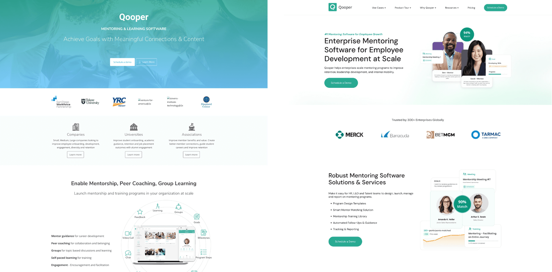
See the old one on the left and the new one on the right.
2. Strategic Solution: Transition to a "Use-Case Driven" Architecture
Working alongside Business, Marketing, and Sales stakeholders, I completely overhauled the information architecture, shifting from broad industry categories to a Solution & Use-Case First Framework.[Legacy IA] ➔ Generic Pages (Companies / Universities) ➔ Low Relevance ➔ High Bounce
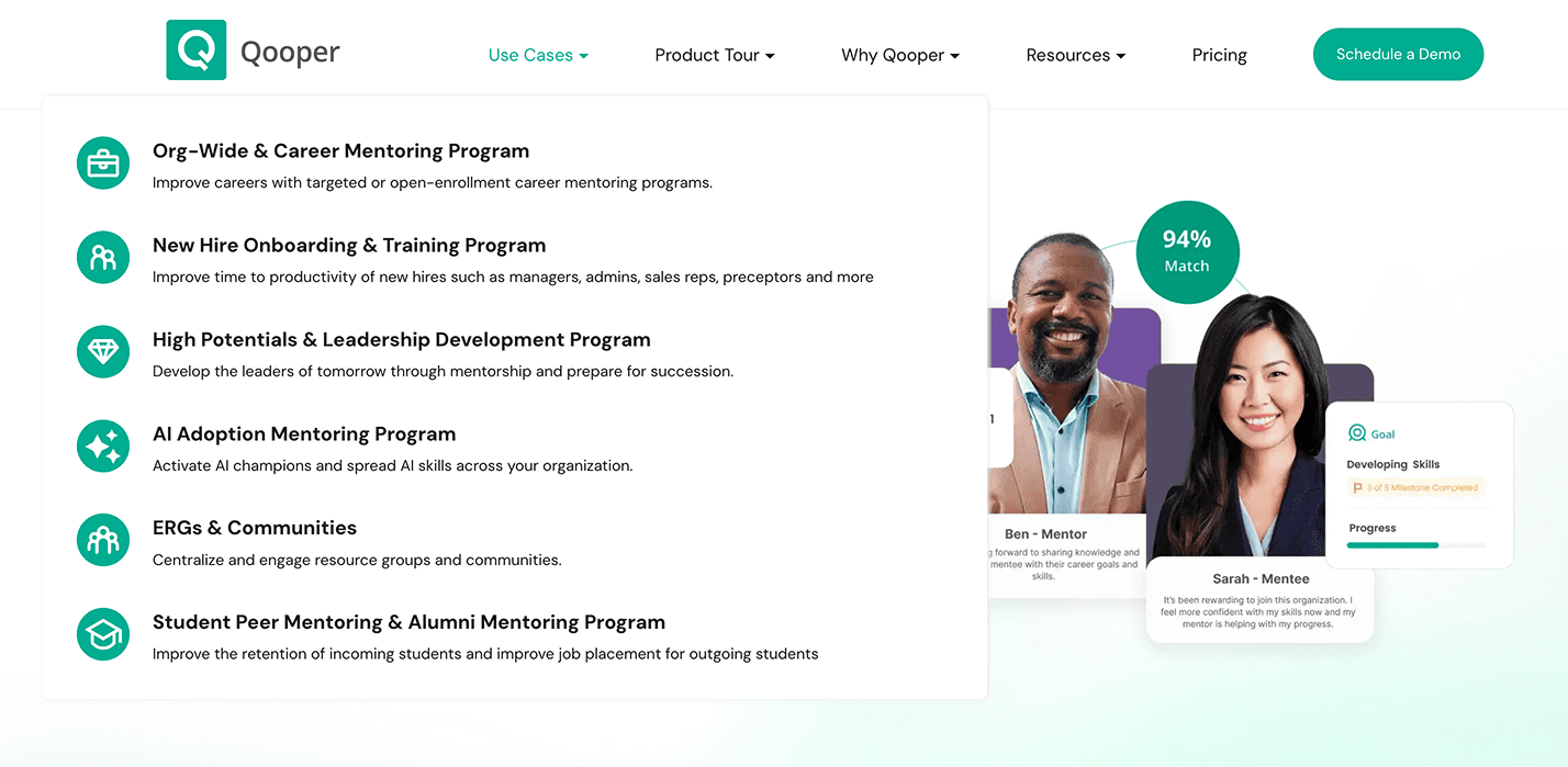
[Redesigned IA] ➔ Targeted Use Cases (Org-Wide / New Hire / ERGs / Leadership…) ➔ Tailored Messaging ➔ High Conversion
Key Design & UX Decisions
Hyper-Targeted "Use-Case" Landing Pages:
Re-structured the site around distinct, high-intent organizational goals:
Org-Wide & Career Mentoring
New Hire Onboarding & Training
High Potentials & Leadership Development
ERGs & Inclusive Communities
Student Peer & Alumni Mentoring
Value-First Page Layouts: Each Use-Case page was structured to elevate the most critical features, ROI metrics, and social proof relevant to that specific persona at the very top of the page.
From Product Screenshots to "Marketing Visuals":
Completely redesigned every product visual. Raw software screens were transformed into polished, illustrative marketing assets highlighting core features (e.g., matching workflows, tracking dashboards) with clear visual hierarchy.
Strategic CRO & High-Intent CTAs:
Designed a 100% responsive, modern UI with strategically placed Lead Generation CTAs (Interactive Demos, Book a Consultation) stickied across natural scrolling break-points.
3. Technical Constraints & Design Trade-offs
Hubspot CMS Capabilities & Technical Workarounds:
Constraint: While Hubspot CMS is excellent for Marketing and SEO operations, its native styling and component capabilities were severely limited for modern, dynamic B2B SaaS web design.
Trade-off & Execution: Instead of compromising on visual quality, I designed modular, reusable component libraries in Figma and worked directly with HTML/CSS and JavaScript to code custom Hubspot templates. This granted full design freedom without disrupting the Marketing team's content management flow.
4. End-to-End Contribution & Methodology
Discovery & UX Audit: Analyzed drop-off points, user session recordings, and marketing campaign landing pages.
Cross-Functional Alignment: Facilitated workshops with Marketing and Sales leads to align target keywords with real customer pain points.
Information Architecture & Wireframing: Mapped out new site trees, modular page templates, and navigation hiearchies.
Visual Asset Production & Component Library: Designed bespoke illustrative UI components, iconography, and responsive layouts in Figma.
CMS Implementation: Coded custom Hubspot templates to ensure smooth performance, cross-browser compatibility, and seamless mobile responsiveness.
5. Key Outcomes & Business Impact
🎯 ~60% Surge in Lead Generation: The combination of targeted CTA placements, clear messaging, and persona-driven pages led to a ~60% increase in qualified demo requests.
⏱️ +40% Increase in Time-on-Site: Engaging visual stories and clear Use-Case navigation increased user dwell time by 40%.
💰 Smarter Marketing Spend & SEO Efficiency: The new granular Use-Case structure allowed the Marketing team to launch hyper-targeted ad campaigns and SEO landing pages, drastically lowering Acquisition Costs (CAC) and improving conversion relevance.
Project Gallery